| In our last installment, we focused on the fancy and frilly world of premium car dealership design. A place where corporately-mandated building design matches (hopefully) the quality materials of said corporation's luxury car…adding to the experience for would-be customers. The same is true for lower priced, more approachable brands: except when the Bass Pro Shop influenced Mark Heitz Chevrolet takes the fight against The Man to new "Heitz"…and loses. According to the David Stanley Facebook page (above photo), the great outdoors is still there…but what's gonna happen once the RenCen Boyz have their way with this building?
While Chevy's blue and silver theme is unique-ish, the oversized/McMansion entryway facade and silver paneling is a cheap and easy way to give a clean and cohesive look for a brand across the country. And you will see it with many, many more brands. To wit:
The next step up in GM's hierarchy: lotsa silver paneling in the McMansion entry with black/white square panels from the remainder of a Buick (Pontiac) GMC dealership. I must admit, the McMansion entryway is pretty impressive with these dealerships, the arched portion is unique and eye-catching. And, GMC Sierra notwithstanding, every vehicle within this unique building doesn't look like a re-badged Chevy, either. Nice.
Then again, when you emerge post-bankruptcy in the same shape as Chrysler, having each brand individually represented isn't a half bad idea. More to the point, here's the same dealership showing off all its wares. If/when a CJD store opens a Fiat franchise on the same property, the branding headache gets even worse.
STOP IT WITH THE SILVER PANELING ALREADY, DAMMIT! But seriously, this is getting out of hand…even if Ford's strong(er than ever) connection to their Teutonic German operations makes the paneling more logical than what's at Chevy and CJD. A Ford Mondeo Titanium is just a really cheap BMW 5-er, right? Right! So buy a Teutonic Taurus SHO and go pick a fight with a Teutonic M5! Ford's McMansion entryway is stylish in a Mr.T-Mohawk-meets-PostIt-Note kinda way, even if the glass treatment presented here isn't demanded for every Ford storefront. This is the nicest implementation of the silver panel theme: only failing when paired with a Lincoln facade. Ford's massive overdose of silver paneling clashes with the black and tan marble of said Lincoln Motor Company. In the world of monkey-see-monkey do designs prevalent in Detroit's inbred culture–something I briefly, personally witnessed during my tenure at CCS' design studios–this silver paneling problem begs the question: who started this trend? And who are the copycats?
But Toyota's red pinstriped McMansion entryway is set to an intimidatingly large-scale with a sweeping form, large enough to (sometimes) hold a car or three. It works, including integration with Scion signage. This place drives home the fact you are walking into a dealership that sells the well-earned reputation for "Toyota Quality". If that's what you really want.
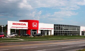
But…the light blue sine wave and BMW-like dome for the McMansion entryway is quite unique. Which is great, in this world of inbred design. I just wish they had more impact, like the red-white scheme of Honda's Canadian dealerships.
This looks like a dealership that would sell a non-Toyota. It looks like what I'd want from Honda. If they still sold 1990′s Civics and Accords with pop-up headlights. But I digress…
What really, REALLY makes a Nissan dealer stand out is their entryway. It's not a McMansion-y facade, at least not like the others. The red internal walls sets the tone for your entrance into the showroom, and if you missed it, that was the same feeling you experienced when you pulled into the lot after seeing their signage. Impressive.
I like VW's extensive use of glass, and the IKEA-quirky minimalist white entryways. There's nothing McMansion here, even if you don't necessarily know which door takes you into the showroom. Is that a good or bad thing?
I've yet to see one of these new Hyundai dealership designs in person, but there's no silver paneling. And while the entryway isn't cheesy, it's a bit uninspired. Good enough: a safe design for a company putting out some impressive product these days.
Ditto the new KIA dealerships. And WOW, is this the future for all KIA dealers? Considering the Audi-influenced Tiger Nose designs on their product, it's no surprise they are pushing very Audi like designs on their storefronts. I like the black tiles reserved for the dealership's name, and the Buick-GMC-like arc that integrates into the entire form. This has potential to be the nicest non-luxury building design! And we need to…because…
I really, really miss the HUMMER dealership. Not that I gave a crap about their boxy wagons, although they were rather impressively styled. These dealerships were stunning! The overriding arch theme meant that a conventional box of a building was not HUMMER worthy. The gigantic "H" for the entryway's facade, the extensive use of glass, ballsy aluminum roofing material, and steel I-beams made for a phenomenal SUV dealership. It promised something that perhaps the HUMMER brand itself couldn't deliver…at least not for the long haul. Thank you all for reading, have a great Sunday. from The Truth About Cars http://www.thetruthaboutcars.com | |||
| | |||
| | |||
|
Saturday, June 29, 2013
Vellum Venom Vignette: Auto Dealership Design? (Part II)
")

")
")
")
")
")
")

")

")
")
")
Subscribe to:
Post Comments (Atom)
No comments:
Post a Comment